<!-- ========================================
デザイン02 矢印
======================================== -->
<section id="arrow">
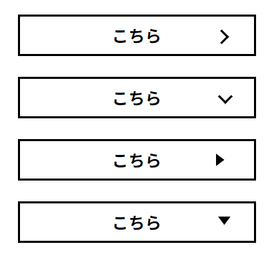
<div class="arrow-01">
<p>こちら<span></span></p>
</div>
<div class="arrow-02">
<p>こちら<span></span></p>
</div>
<div class="arrow-03">
<p>こちら<span></span></p>
</div>
<div class="arrow-04">
<p>こちら<span></span></p>
</div>
</section>
/* =================================== */
/*   デザイン02 矢印   */
/* =================================== */

/* arrow-01  >  */
#arrow .arrow-01 p span {
  position: absolute;
  display: block;
  inset: 0;
  margin: auto 10% auto auto;
  width: 10px;
  height: 10px;
  border-top: 2px solid #000;
  border-right: 2px solid #000;
  transform: rotate(45deg);
}

/* arrow-02  > 下向き  */
#arrow .arrow-02 p span {
  position: absolute;
  display: block;
  inset: 0;
  margin: auto 10% auto auto;
  width: 10px;
  height: 10px;
  border-right: 2px solid #000;
  border-bottom: 2px solid #000;
  transform: rotate(45deg);
}

/* arrow-03  ▶  */
#arrow .arrow-03 p span {
  position: absolute;
  inset: 0;
  margin: auto 10% auto auto;
  width: 0;
  height: 0;
  border: solid 6px transparent;
  border-left: solid 8px #000;
}

/* ↓↓↓↓↓↓↓↓↓↓↓↓↓↓ */
/* clip-pathプロパティを使った▶ */

.triangle {
  clip-path: polygon(0 0, 0% 100%, 100% 50%);
  width: 100px;
  height: 100px;
  background-color: red;
}

/* ※CSS:clip-pass maker */

================

/* arrow-04  ▼  */
#arrow .arrow-04 p span {
  position: absolute;
  inset: 0;
  margin: auto 10% auto auto;
  width: 0;
  height: 0;
  border: solid 6px transparent;
  border-top: solid 8px #000;
}


/* 装飾用 */
#arrow p{
  position: relative;
  width: 100%;
  max-width: 230px;
  margin: 0 auto 20px;
  padding: 10px 60px;
  border: 2px solid #000;
  color: #000;
  font-size: 1.6rem;
  line-height: 1;
  font-weight: bold;
}
参考:https://design-library.jp/lab/category/arrow
参考:https://design.webclips.jp/css-arrow/